Scenic Rise - Branding
Case Study
The Brief
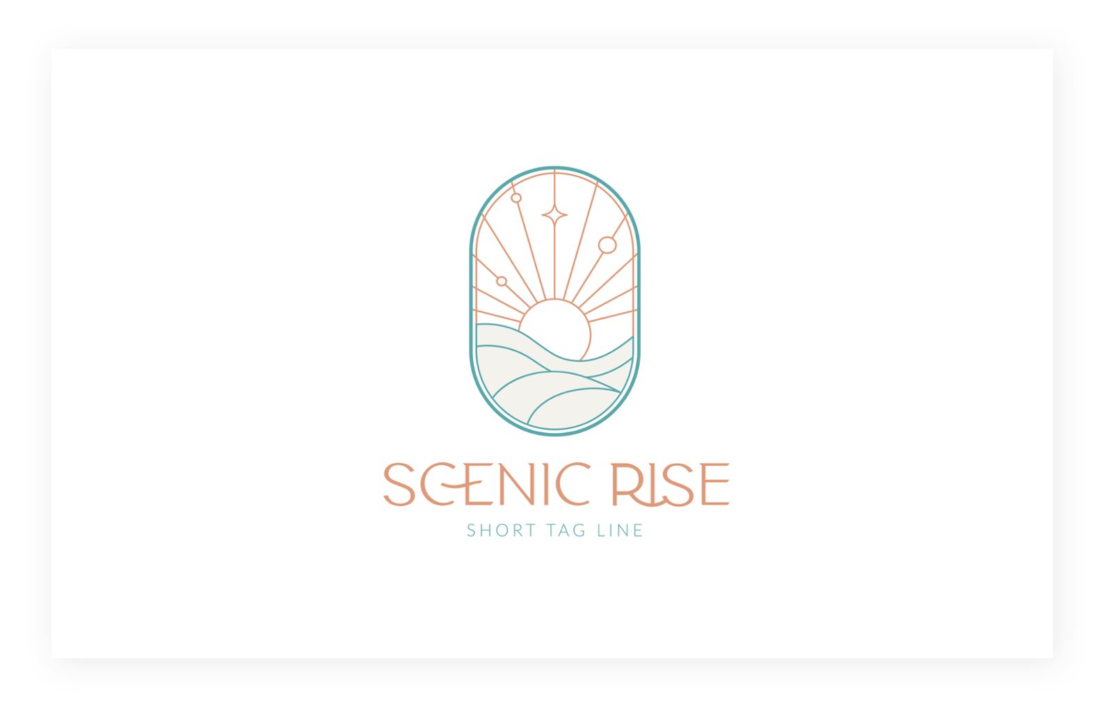
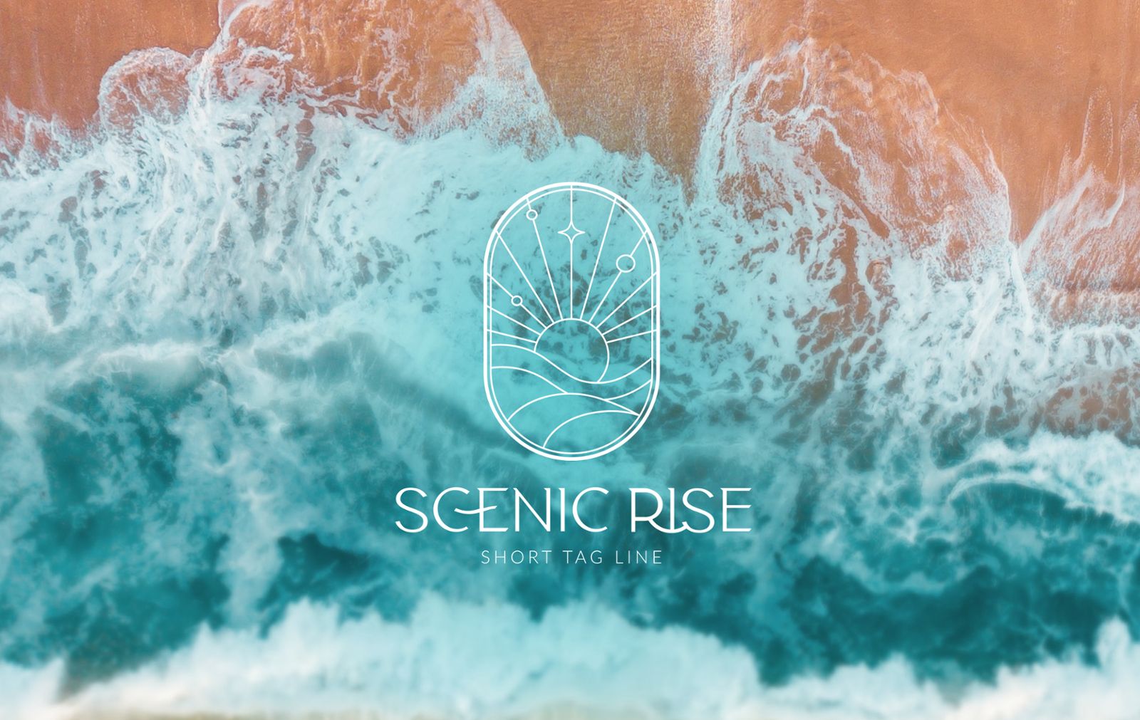
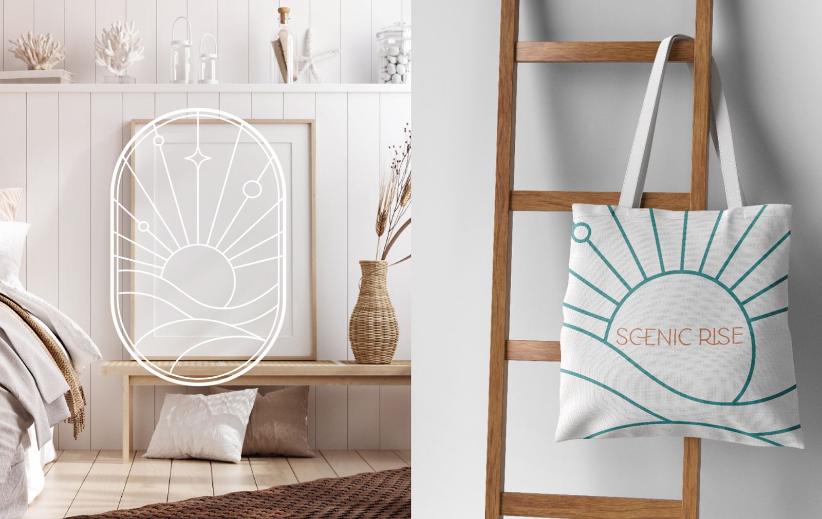
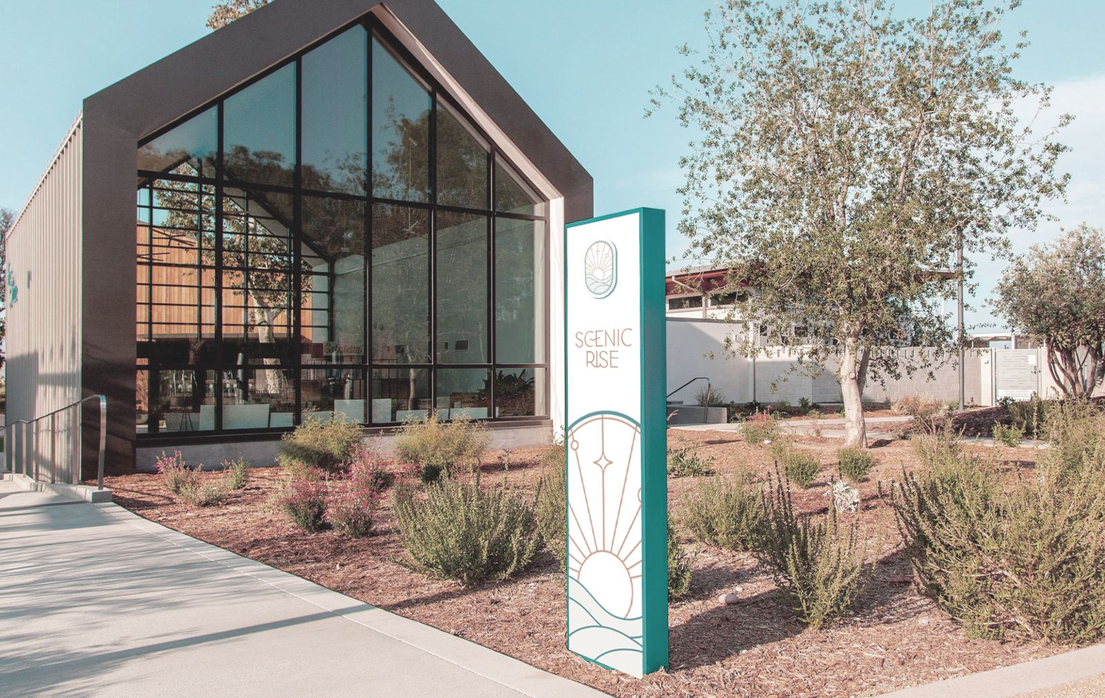
Scenic Rise is a brand-new property development nestled along the picturesque South Coast. To truly capture the essence of this aspirational coastal lifestyle, Hughes embarked on a journey to create a fresh visual identity.
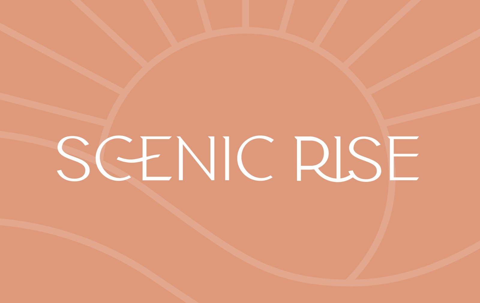
Drawing on key visual elements from supplied 1960s - 70s surf couture; Hughes developed the concept of gentle topography and sea views utilising the same thin line style and beach tones from that era.
The font choses mimicked a 1910 style called art nouveau which has become very popular for premium brands, and was later adapeted into many of the fonts used in the 60s and 70s.
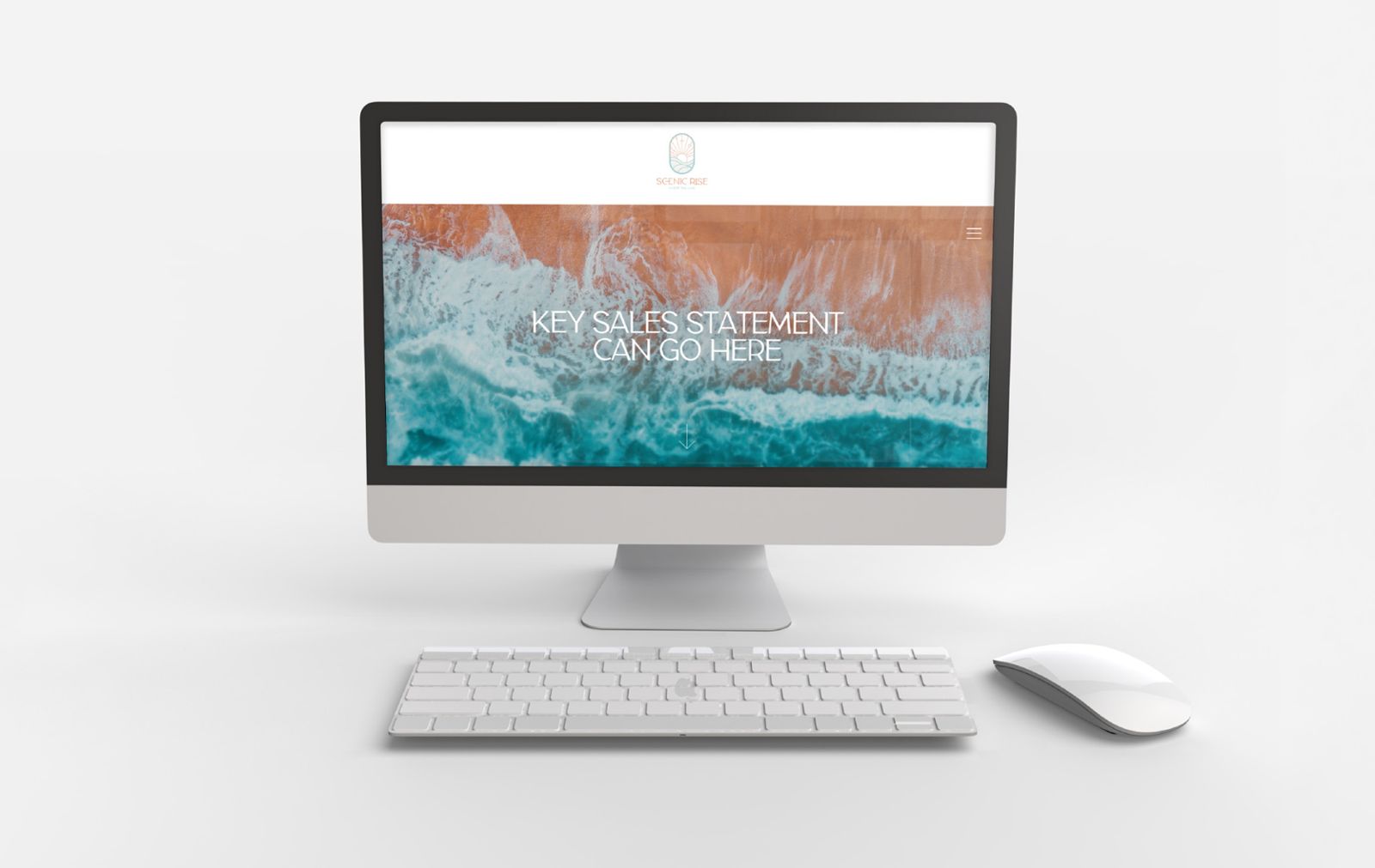
The identity targets an audience of young & middle aged people who appreciate the SeaChange qualities of the South Coast. The visual identity worked across multiple platforms from digital, print, and physical instilling trust in the brand, which will assist in the volume and value of sales.
Learn more about our design services, view more design case studies, or talk to us today.
Suggested