Services
Strategic Communications
Public Relations
Issues and crisis management
Graphic Design
Social & Digital
Video Production
Training
About
Our Company
Our People
Clients
Our Clients
Testimonials
Work
Case Studies
Our Industry Experience
News
Latest News
Our Newsletter
Contact
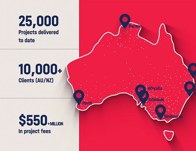
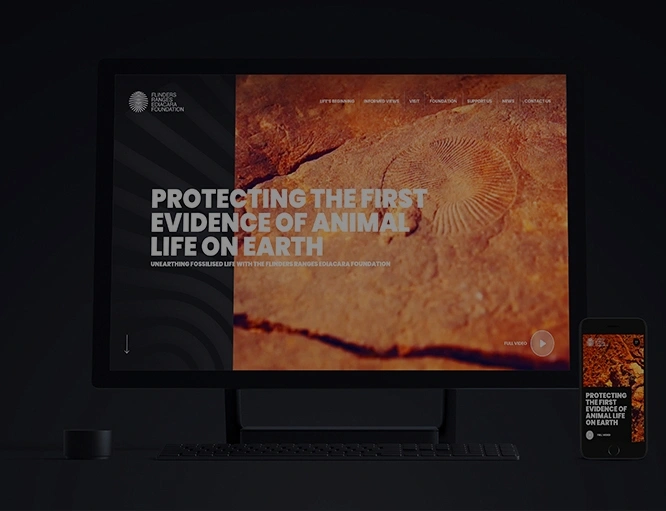
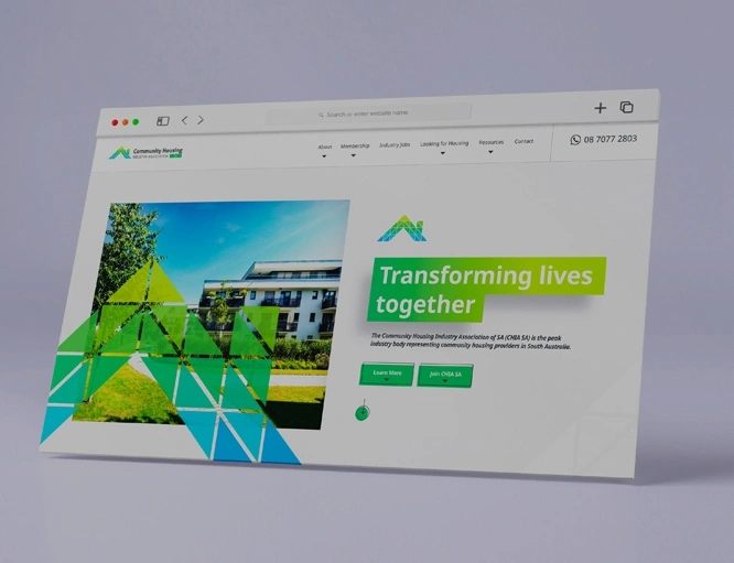
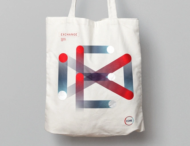
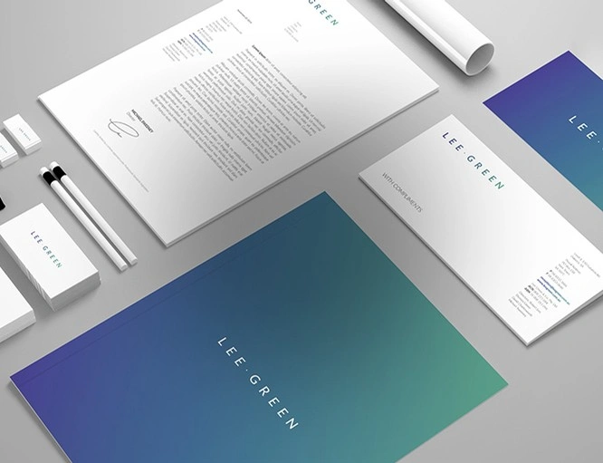
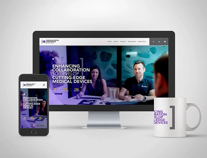
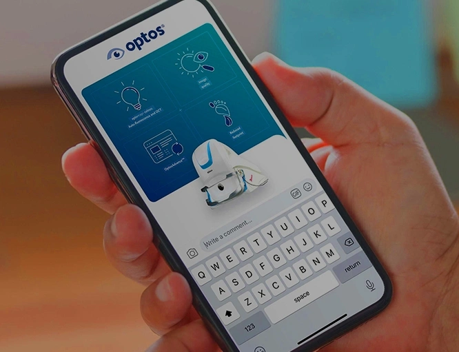
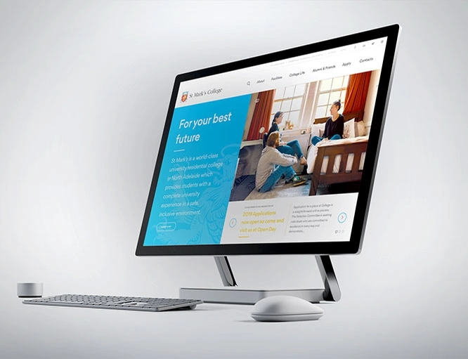
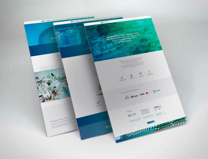
Case studies
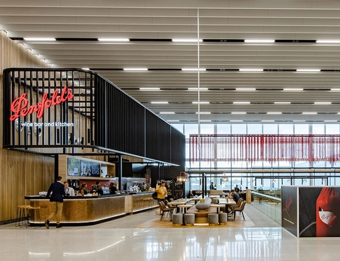
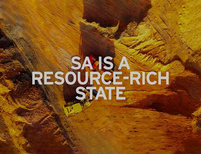
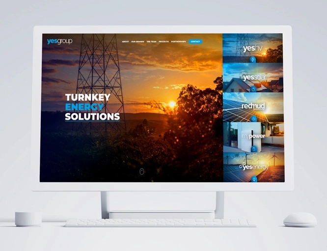
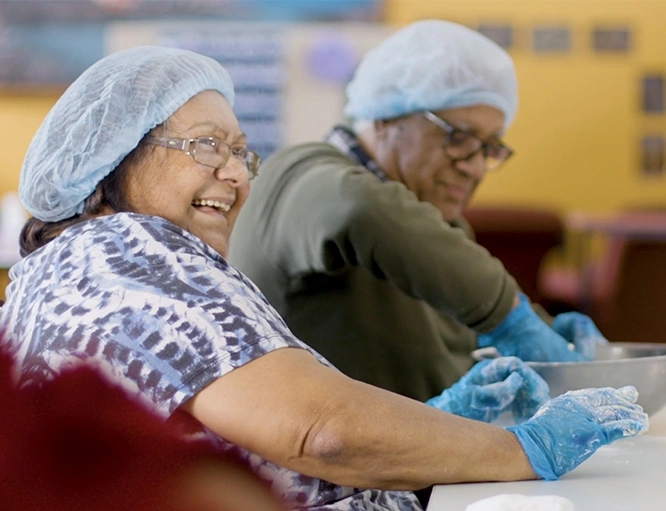
Read about the projects Hughes has managed for a varied and growing list of clients.
Case Studies
Filter By
All Work
Public Relations
Social & Digital
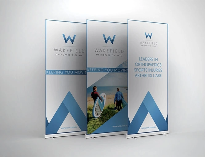
Graphic Design
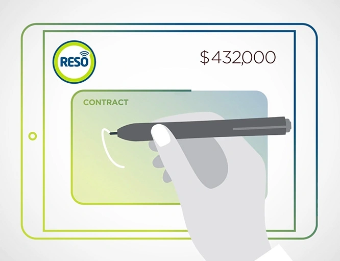
Video Production
Sign up to Hughes News
Signup