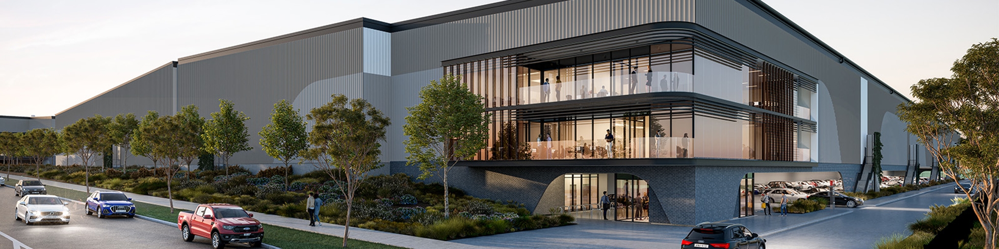

Crosspoint Industrial, a project owned and managed by Aware Real Estate and developed by Barings, is a significant new and exciting development in the Western Sydney Aerotropolis. Its prime location provides seamless access to major roads, the airport and cargo precinct, streamlining freight movement for tenants and supporting supply chain partnerships.
Hughes was engaged by Aware and Barings to develop the Crosspoint industrial park brand, including name research, brand identity development, key messages development, website development, information memorandum copywriting and design, and PowerPoint template design.
This multifaceted project involved strong collaboration between our PR, digital and design specialists.
Objectives
The primary objectives were to:
- Position Crosspoint as a premium and connected offering within the Aerotropolis, ideally suited to attracting logistics and supply tenants.
- Build a unique and industrial visual identity for the Crosspoint brand, delivered across all materials (both digital and print).
- Create a website and supporting sales collateral to attract tenants and drive enquiries.
- Integrate existing sales content, supplied renders and video into the new brand identity.
- Position the project as part of Aware Real Estate and Barings strong track record in sustainable, partnership-based industrial developments.
Our Approach
Hughes began by conducting an environmental scan of industrial parks across Sydney and the broader East Coast, to inform project naming and brand positioning. This research helped solidify the rationale for Crosspoint – a name referencing the park’s intersection at the major roads The Northern Road and Elizabeth Drive.
With the name confirmed, Hughes worked collaboratively with Aware Real Estate to consolidate all the known project information and content to then conduct a detailed website scoping, including sitemap creation, combined with key message development.
From this foundation, Hughes delivered:
- A complete brand identity including logo, visual elements, typography, colour palette and style guide.
- A website content plan aligned to the sitemap.
- Custom maps, icons, and imagery to support narrative building.
- Website copywriting and adapted content for the information memorandum.
- A curated stock image library to complement supplied renders.
- Masterplan customisation using new brand elements.
As part of the project, Hughes also worked collaboratively with Aware’s external visual supplier to share brand elements and graphics for the project’s video, later integrated into the website header to provide a high-impact first impression for users.
Branding
The primary challenge was to differentiate Crosspoint within a crowded industrial park landscape, while maintaining a sense of strength, innovation and location relevance.
Our solution was a contemporary visual identity that reflects the energy of the industrial sector, while reflecting the forward-thinking vision behind the development.
The name ‘Crosspoint’ inspired a logo built around intersecting forms, symbolising connection and momentum, while also referencing the park’s location beside a key intersection. The metallic gradient and dynamic angles express movement and reinforce the industrial theme, while the bold orange injects energy and optimism. Strong, clean typography underpins the ideas of innovation and strength. The result is a brand that feels modern and dynamic - positioning Crosspoint as a place where innovation, infrastructure and opportunity meet.
Website
A seamless customer journey formed the core of the website strategy. Internal page links, structured content layouts and clear call-to-actions guide potential tenants through the site, maximising the opportunity for enquiry.
To further support this, we developed key messages and iconography used across each page to quickly convey points-of-difference in the offering, helping users evaluate the suitability of the project for their needs.
Throughout the process we worked closely with our key contact, Renee, to refine messaging, modify page layouts, select imagery, evolve design elements and confirm functionality.
Suggested