Urological Solutions - Complete Rebrand
Case Study


The Brief
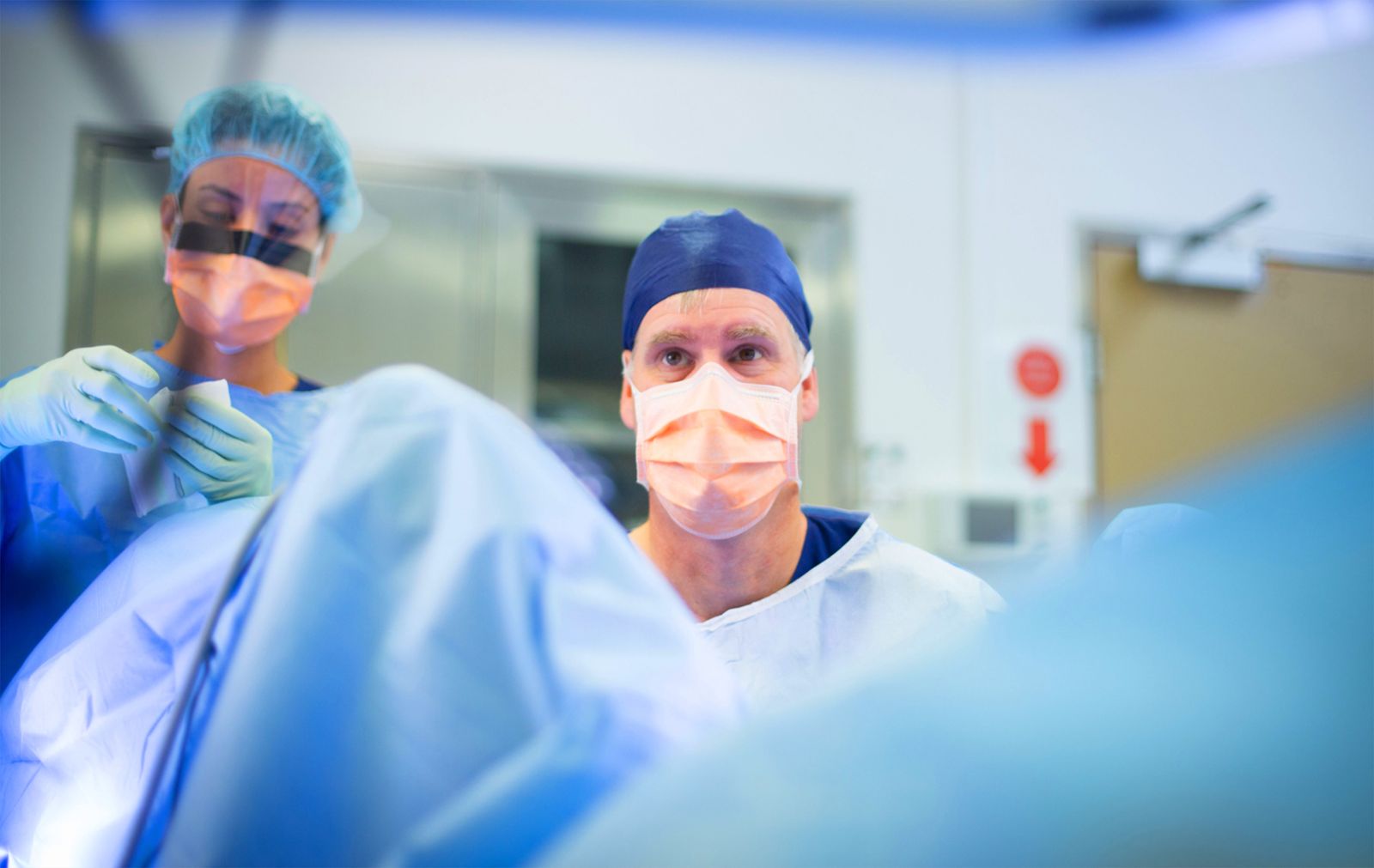
Urological Solutions is a comprehensive urological surgical practice, involving specialist surgeons who work collaboratively to ensure the best outcomes for their patients.
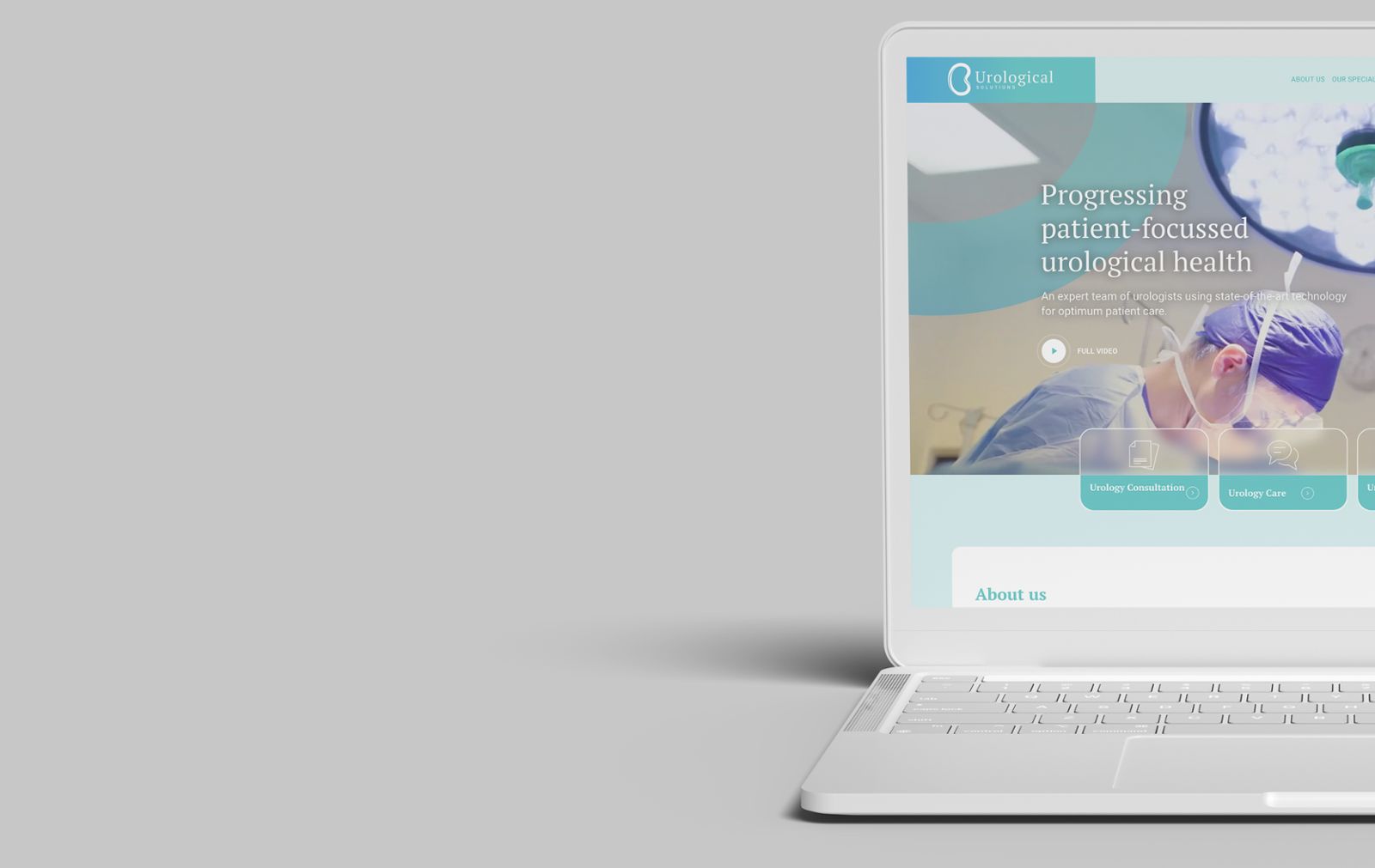
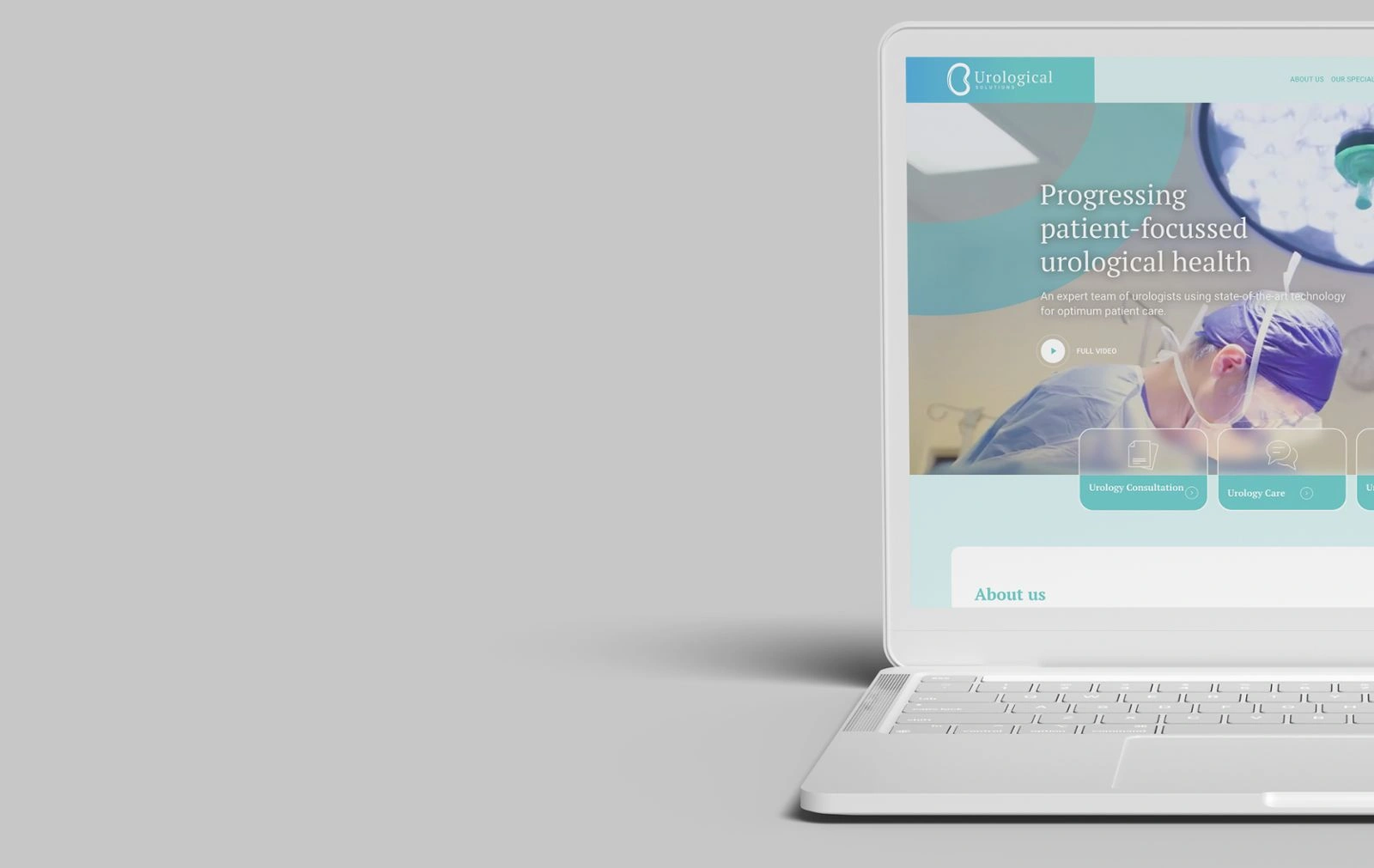
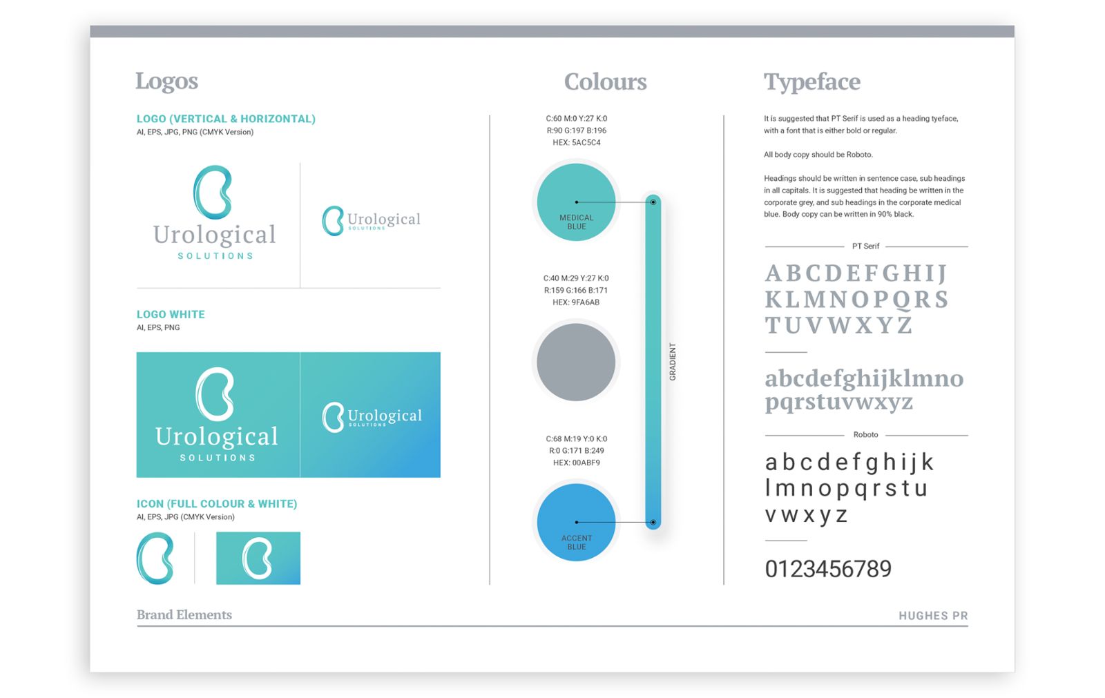
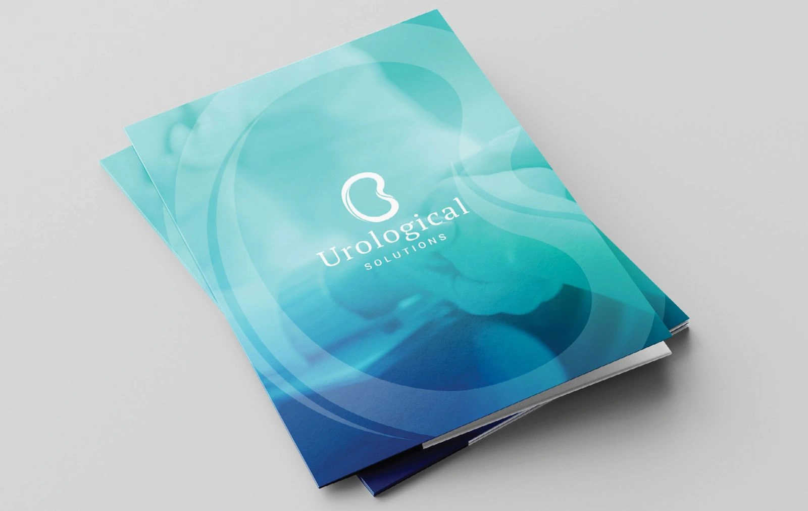
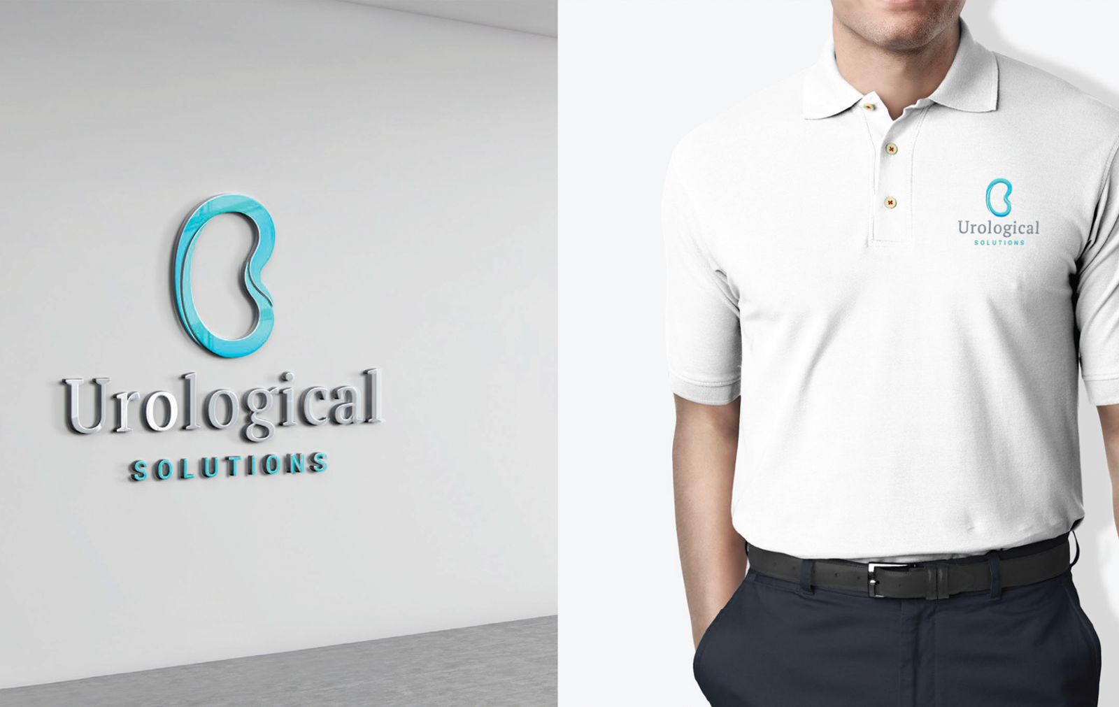
Having been established in 2003, the clinic required a complete refresh to it's brand and online presence. They approached Hughes to initially redesign their logo. A stylised logo based on a Kidney shape and incorporating the letter 'U' subtly was designed in fresh medical blue tones.
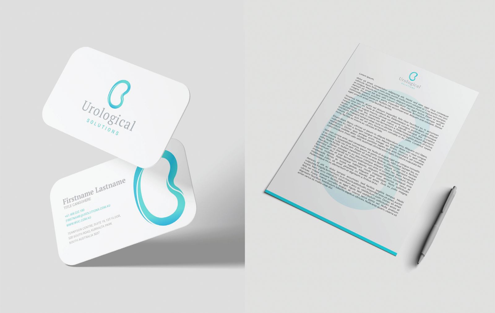
The logo was then applied to a varied range of marketing collateral, uniforms and stationery ensuring consistency across the practices' visual communications.
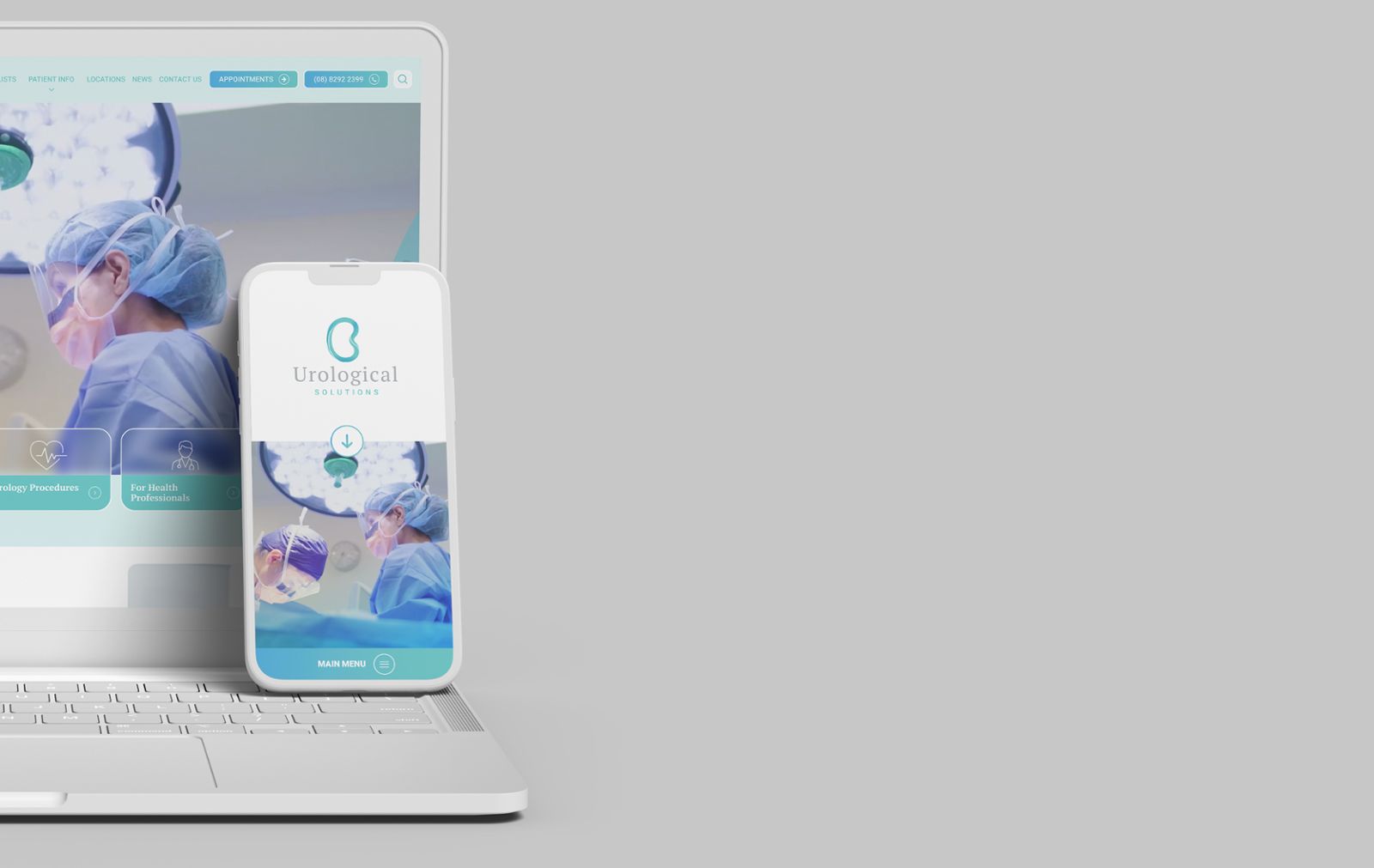
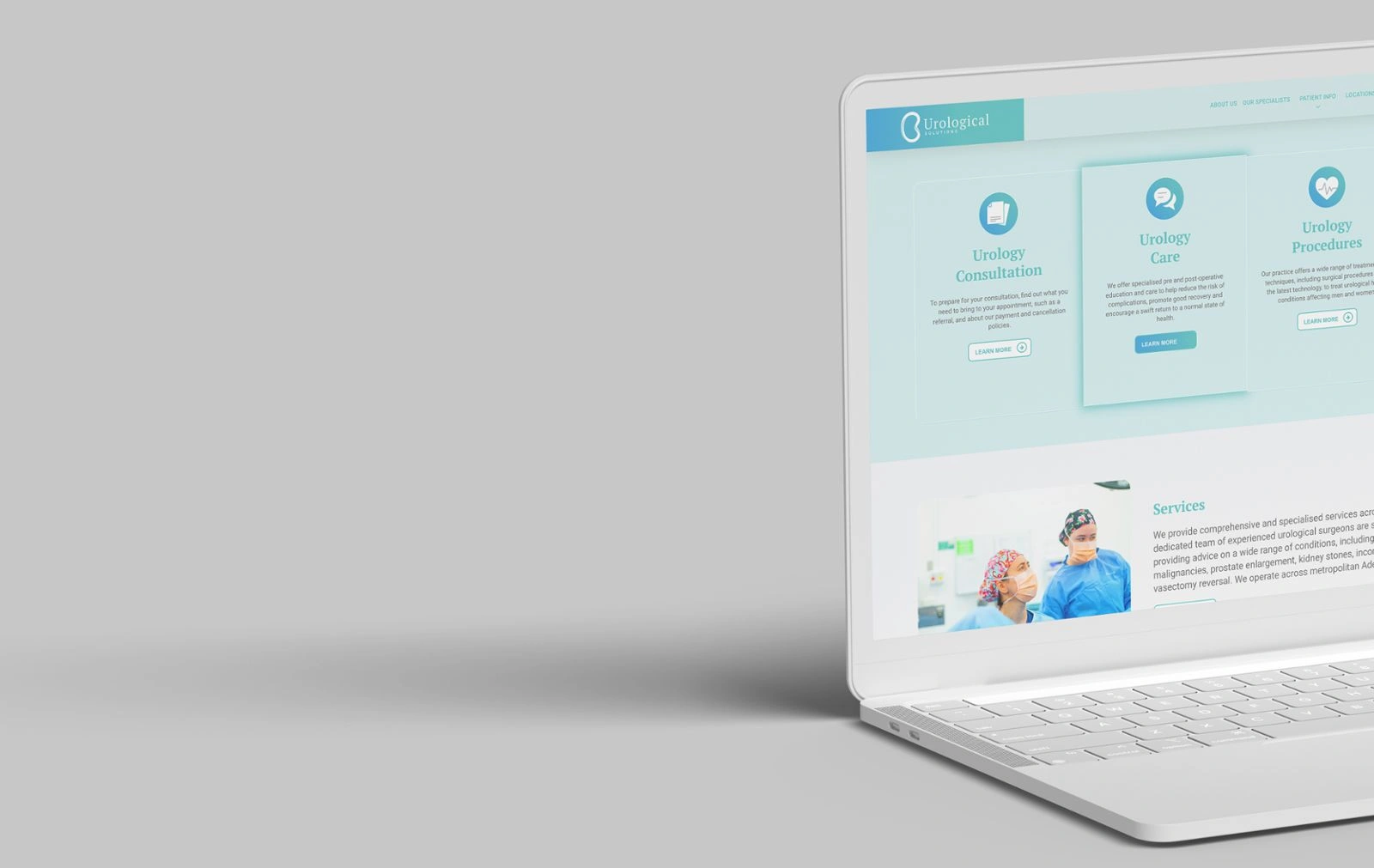
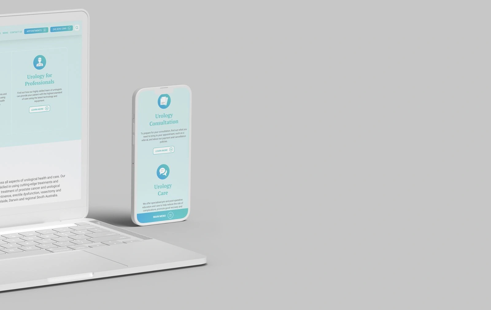
The next stage was the website development which incorporated web design, video, copy writing and photography. During the web design process a corporate explainer video capturing the patient centred, collaborative approach of the clinic was filmed. Staff profile photos as well as a whole suite of photos were taken at the same time and utilised throughout the web design. The language and copy on the site was also refined to better reach the target audience.
Social media assets were also designed and a strategy implemented for when the website would launch and going forward.
To view the website please - CLICK HERE
To view the corporate video please - CLICK HERE
Learn more about our design services, view more design case studies, or talk to us today.
Suggested