Australian Science Media Centre
Case Study
The Brief
The AusSMC approached Hughes PR to refresh their visual brand and apply this across all their collateral and online presence.
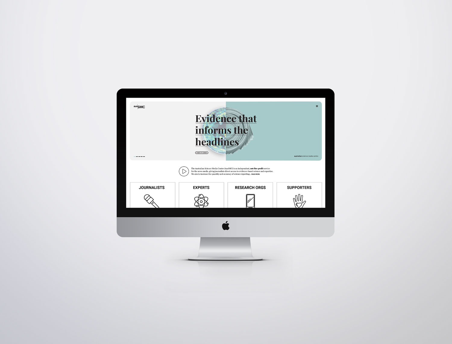
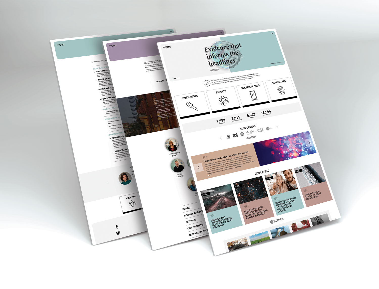
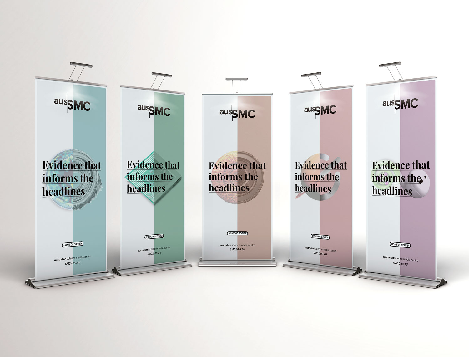
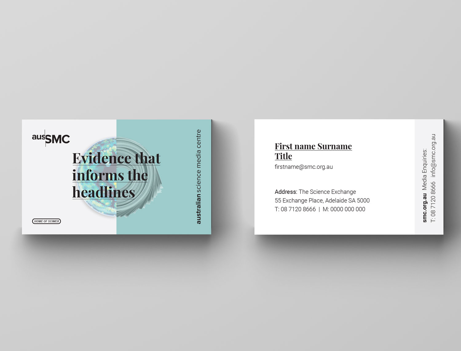
AusSMC visual identity and collateral
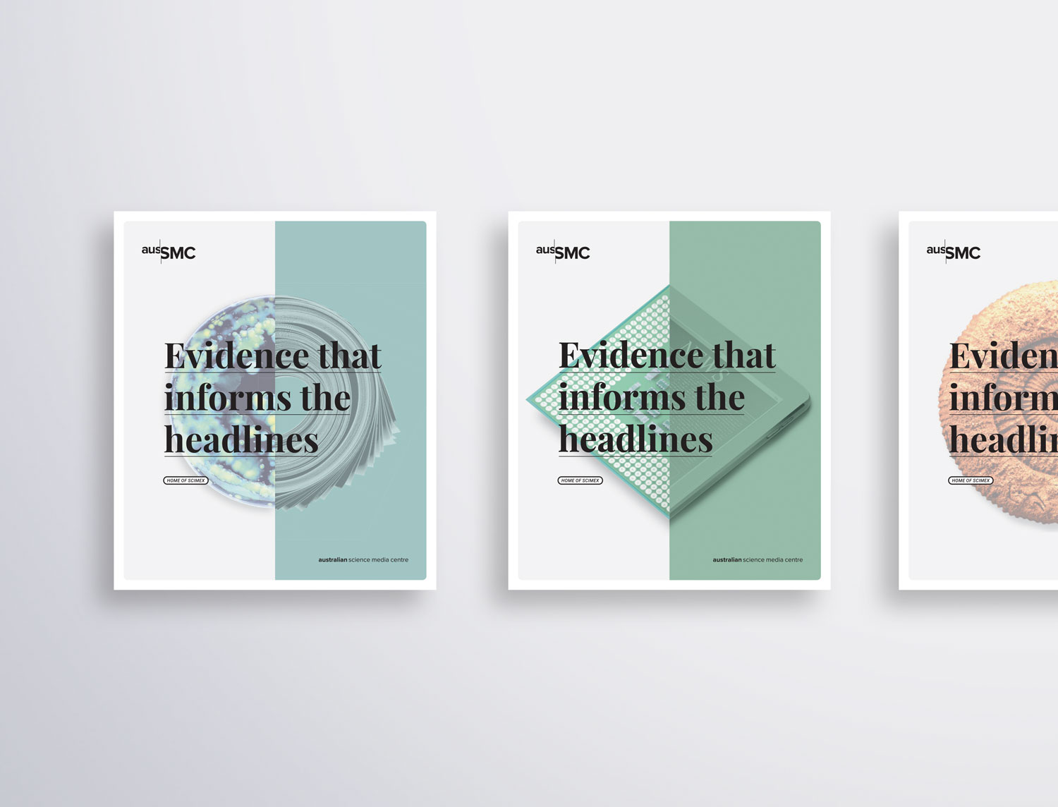
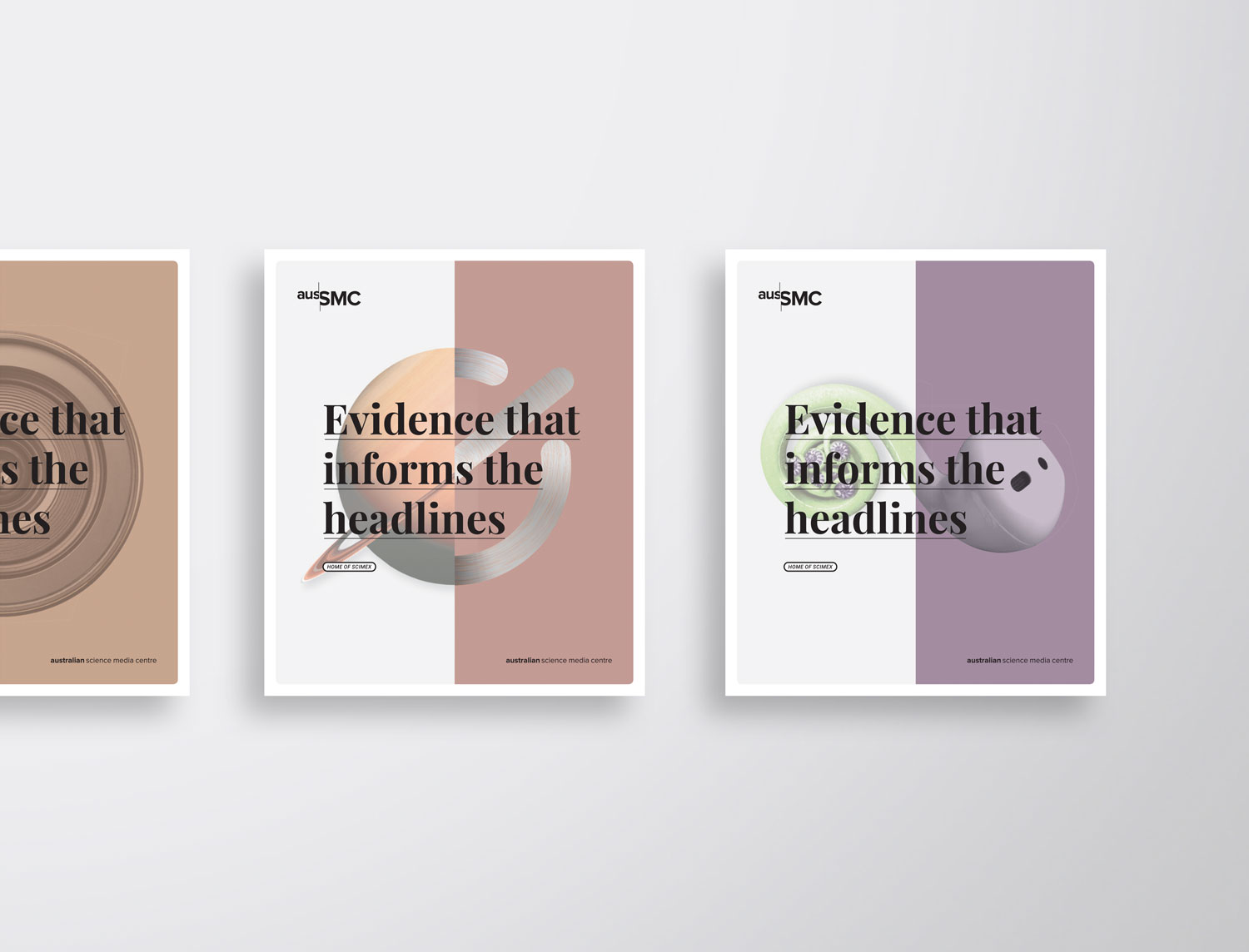
Initially working with Hughes to refine their marketing strategy going forward, a positioning statement was developed which would appear on their core marketing material; ‘Evidence that informs the headlines’. Five key distinctive brand assets were then developed. These were striking visuals which told the story of the unusual intersection between science and media, that the AusSMC facilitates. These devices would also provide a platform for the slogan to be displayed. The logo colours were pared back to a flat black to contrast a new colour suite. These colours helped reflect the progressive nature of science, their human and community focus, as well as creating greater flexibility across their diverse areas of delivery.
Suggested