Latest News
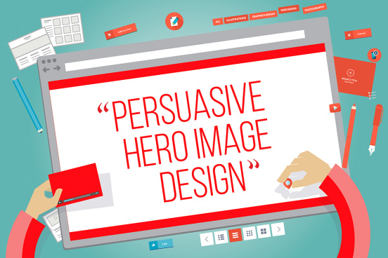
Hughes blog post: Engaging users with persuasive ‘hero image’ design
We all know the internet is a crowded space with millions of websites, many poorly-designed, competing for the attention of users.
When people visit your website, one of the first things they see is your website’s 'hero image’. A well-designed and relevant hero image will help your site cut through the Internet clutter and quickly win over the user, so they are compelled to keep scrolling.
Here are a few simple tips and techniques that you can apply to your website’s hero space, and some examples of sites with hero imagery done well.
High Impact
Full scale responsive images have become common place now as internet connections have sped up. Don’t be shy, and use this space to its full potential. This web site by CH Hausmann is a perfect example.
Keep it simple
Yes that old chestnut rings true again. Minimal visual elements and messages in the hero will actually raise the credibility of your brand. The Seattle Cider Company have used nothing but a branded image, their logo and a tagline.
Great Photography
Whether it’s photography or artwork, it needs to be attractive and relevant to the user and to your brand. Grain & Mortar have used some great personalised photography to express who they are. As you learn more about their company, you’ll discover something that’s really important to them is working with clients who get them.
Branding
This does not just include your logo. The hero image itself and all the other elements also need to speak to your brand. The imagery used on the Adelaide Zoo website, particularly the hero images, consistently carry through a branded treatment. Light green is usually very dominant, tying in with the logo, and a spot focus is used.
Text only
These sites buck the trend by only using text in this space while keeping the large responsive image size. See how bold this technique can be at the New Wave Company website.
Animation
Animation is powerful in telling your story, keeping the user, and helping your site stand out from the crowd. At this point in time, animation is still a bit of a novelty in hero design. Have a look at how Dog Studio cleverly integrate it into their hero images and throughout their web site.
Bold Headings
In terms of hierarchy, making the heading stand out over your logo, main navigation and background image is a great way to maximum its impact. Checkout how Rainmaker, a digital marketing advice website have done this.
My Predictions for 2015 web design
I believe fly-out side menus will become popular over 2015. At first you may find them jarring, as most changes to website user interfaces are. However they create a more tailored experience on mobile, not just desktop. See how the RAWNET’s web site looks on desktop and mobile to get a better understanding of this new format.
A few subtle changes to a website hero image can make a huge difference to the level trust users have in your brand and their experience on your site. If you ever want to have a conversation about smart website design, feel free to get in contact with the digital team at Hughes.
- Luke Howard
Recent News
- Blog: Navigating the changing media landscape
- $48M affordable housing hub revives beachside site
- Covid success story: SA digital transformation start-up expands interstate
- Industry leader Mark Smith appointed National Pharmacies CEO
- Mellor Olsson appoints new CEO
- Indonesia AirAsia touches down in Adelaide, enabling affordable connectivity across Asia via Bali
- Playgroup reimagined: Elders and children connect at ACS's Aboriginal aged care home
- Apartment living reaches new heights with $120 million Parkline development topping out
- A Fresh Take on Strawberries: Premium Packaging that Looks as Good as it Performs
- Paper & board packaging leader unboxes new global HQ in Adelaide
- Lutheran Homes Group brings its high-quality aged care to regional Victoria in historic expansion
- Blog: The growing AI threat - what it can mean for your brand and reputation
- CH4 Global named as one of the world’s top Sustainable Development Goal leaders
- Scotch AGS Vietnam’s inaugural SACE graduates go global
- Gen Z and the future of AI
- Qantas international services return to Adelaide
- Blog: Let’s get (a)political: all you need to know about elections and public relations
- The world’s most valuable dog toy revealed in the lead up to Guide Dogs Day
- Skytrax names Adelaide as best regional airport in Australia & Pacific region
- Indonesia AirAsia To Touch Down in Adelaide for the first time in June Fares on sale today starting from just AUD$199*!


